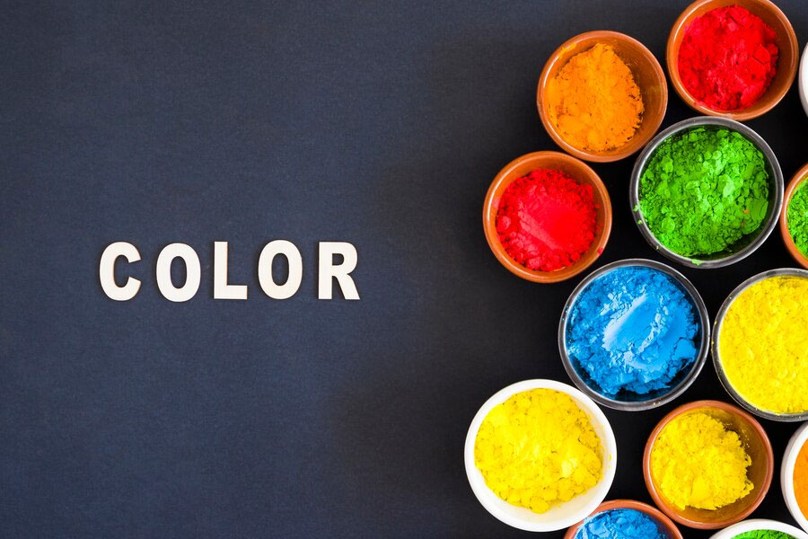
The Power of Color: Choosing Shades That Enhance Your Business Brand

Color is a great tool in branding. The shades you pick can influence perception, evoke emotion, and represent the essence of your business. Whether starting from scratch or rebranding an existing business, knowing how color impacts perceptions and the choice of shades will make all the difference for your brand identity. Here’s how to tap into the power of color to build up your business brand.
The Psychology of Color
Colors bring about specific emotions and connotations. Understanding these associations helps you choose colors that best suit your brand’s message and values.
Red
Red is a vibrant and energetic color. It captures attention and can provoke excitement, passion, and urgency. Brands like Coca-Cola and Red Bull use red to project energy and enthusiasm.
Blue
Blue represents trust, serenity, and professionalism. Businesses related to the tech industry or finance tend to employ it often. Brands like IBM and American Express use this color to represent trustworthiness.
Green
The green color indicates growth and health and symbolizes being earth-friendly. Whole Foods, Starbucks, and many such brands adopt it because it is about health or environmental wellness.
Yellow
Yellow is bright and full of optimism. It could be associated with happiness and positivity. Brands like McDonald’s and IKEA often use yellow to create an inviting and friendly atmosphere.
Black
Black represents sophistication, elegance, and power. Such brands as Chanel and Mercedes-Benz often use black to portray exclusivity and high-quality products.
Purple
Purple is linked with creativity, luxury, and wisdom. Brands such as Cadbury and Hallmark often use it to convey quality and creative thinking.
Orange
Orange combines the energy from red and the cheerfulness of yellow. Orange represents enthusiasm, creativity, and adventure. Brands such as Nickelodeon and Fanta often use orange to convey fun and excitement.
White
White communicates purity, simplicity, and purity. Brands like Apple and Nike use white to talk about the minimalist aesthetic associated with modernism.
Pink
Pink often talks of femininity, play, and kindness. Brands using pink include Barbie and Victoria’s Secret. Pink often talks about the targeted predominantly female audience and the idea of playing and nurturing.

Selecting Colors for Your Brand
Look at Your Brand Personality
Your brand’s personality should be the foundation of your color choices. Is your brand bold and energetic or calm and professional? Start by listing adjectives describing your brand, then match these qualities with corresponding colors.
Consider Your Target Audience
Various shades could be appealing to different demographics. Consider the preferences and cultural associations of your target audience. For instance, younger people might find vibrant and energetic colors appealing, while more mature people might find them appealing with classic and muted colors.
Analyze the Competition
Look at the color schemes used by competitors in your industry. You want to avoid copying their choices, but understanding the color landscape can help you differentiate your brand. Choose colors that set you apart and make your brand easily recognizable.
Create a Cohesive Color Palette
A solid color palette will include primary, secondary, and accent colors. Your primary color is most associated with your brand and used in your logo and main branding materials. Secondary colors complement the primary color and can be used in additional branding elements, while accent colors add contrast and can be used sparingly to highlight important information.
Test Your Colors
Test the color palette before finalizing it. How do the colors look on your website, social media, packaging, and promotional materials? Do the colors work well together, and are they accessible to all users, including those with color blindness?
Consider Color Trends
While selecting colors that reflect your brand personality is important, keeping abreast of color trends can also be helpful. Trends can affect consumer perceptions and make your brand feel current and relevant. However, ensure that your color selections have longevity and won’t quickly become outdated.

Application of Your Color Palette
Consistency is Key
Consistency in using your chosen color palette across all brand touchpoints is crucial. This includes your logo, website, social media profiles, packaging, and advertising materials. Consistent use of color helps to strengthen brand recognition and build trust with your audience.
Create Brand Guidelines
Brand guidelines that have color palettes and their application will ensure consistency. This is done through the inclusion of specific color codes, such as HEX, RGB, and CMYK, and the way they should be used in different applications.
Assess and Evolve
As your brand grows and evolves, it is necessary to periodically evaluate your color palette to ensure it still aligns with your brand’s identity and resonates with your audience. Be open to making adjustments if required, but always aim to keep the core elements of your brand consistent.
Color is a significant aspect of your brand identity. It allows you to make choices based on shades that suit your brand’s personality and values. You would create a strong, memorable, and impactful brand. Color will then be the perfect differentiation in your business to reach your target audience, further strengthening your overall brand presence.


